Welcome to E2P Simulator! This guide will help you understand what it does, why it is needed, and how to use it.
What is E2P Simulator?
E2P Simulator (Effect-to-Prediction Simulator) is an interactive open-source tool that allows researchers to visually and quantitatively explore the relationships between effect sizes (e.g., Cohen's d, Pearson's r), discriminative ability (e.g., ROC-AUC, sensitivity, specificity), predictive value (e.g., PPV, NPV, PR-AUC), and clinical utility (Net Benefit), while accounting for measurement reliability and outcome base rates (Karvelis & Diaconescu, 2025).
As such, it provides an easy way to perform predictive utility analysis: estimating how research findings will translate into real-world prediction or what effect sizes or discriminative ability are needed to achieve a desired level of predictive value and clinical utility. Similar to how power analysis tools (such as G*Power) help researchers plan for statistical significance, E2P Simulator helps plan for practical significance.
E2P Simulator has several key applications:
Interpretation of findings: It helps researchers move beyond arbitrary "small/medium/large" effect size labels and misleading predictive metrics by grounding their interpretation in estimated real-world predictive utility.
Research planning: Being able to easily derive what effect sizes and predictive performance are needed to achieve a desired real-world predictive performance allows researchers to plan their studies more effectively and allocate resources more efficiently.
Education: The simulator's interactive design makes it a valuable teaching tool, helping researchers develop a more intuitive understanding of how different abstract statistical metrics relate to one another and to real-world utility.
Why is E2P Simulator needed?
Many research areas such as biomedical, behavioral, education, and sports sciences are increasingly studying individual differences to build predictive models to personalize treatments, learning, and training. Identifying reliable biomarkers and other predictors is central to these efforts. Yet, several entrenched research practices continue to undermine the search for predictors:
Difficulty interpreting effect sizes: The interpretation of effect sizes, which are critical for gauging real-world utility, is often reduced to arbitrary cutoffs (small/medium/large) without conveying their practical utility.
Overlooked measurement reliability: Measurement noise attenuates both effect sizes and predictive performance, yet it is rarely accounted for in study design or interpretation of findings.
Neglected outcome base rate: Low base rate of outcomes can drastically limit predictive performance in real-world settings, but is rarely accounted for when evaluating the translational potential of prediction models.
Together, these issues undermine the quality and impact of academic research, because routinely reported metrics do not reflect real-world utility. Whether researchers focus on achieving statistical significance of individual predictors or optimizing model performance metrics like accuracy and ROC-AUC, both approaches often lead to unrealistic expectations about practical impact. In turn, this results in inefficient study planning, resource misallocation, and considerable waste of time and funding.
E2P Simulator is designed to address these fundamental challenges by placing measurement reliability and outcome base rate at the center of study planning and interpretation. It helps researchers understand how these factors jointly shape real-world predictive utility, and guides them in making more informed research decisions. For a detailed analysis of these issues in the context of psychiatry research, see Karvelis et al. (2025).
How to use E2P Simulator
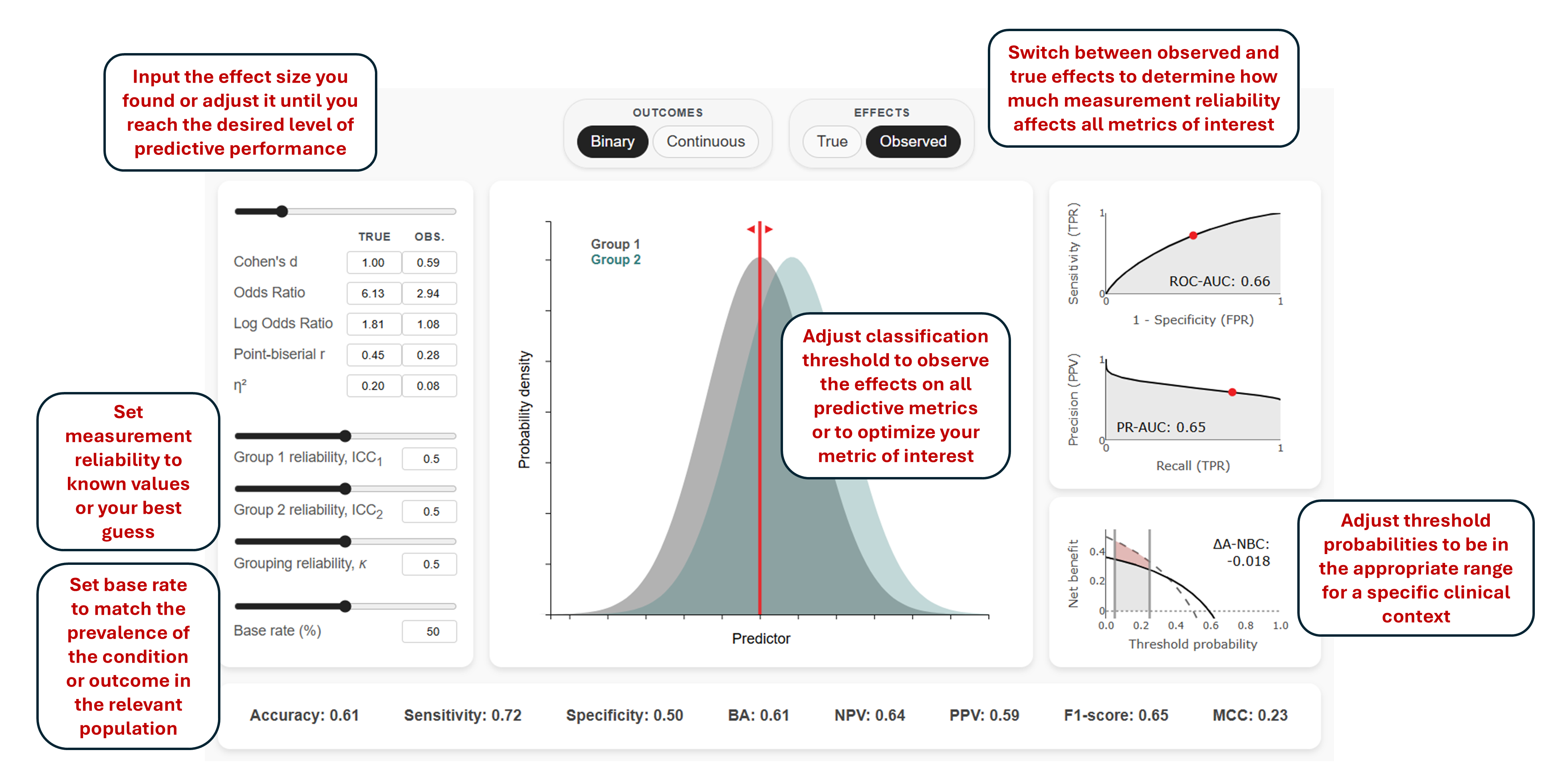
E2P Simulator is designed to be intuitive and interactive. You can explore different scenarios by adjusting effect sizes, measurement reliability, base rate, and decision threshold, and immediately see how these changes impact predictive performance through the visualizations and metrics. Still, in this section we will highlight and clarify some of the key features and assumptions of the simulator.
The image above provides an overview of all E2P Simulator's interactive components.
Binary vs. Continuous Outcomes
E2P Simulator provides two analysis modes that cover the two most common research scenarios:
Binary Mode: Considers dichotomous outcomes such as diagnostic categories (e.g., cases vs. controls) or discrete states (e.g., success vs. failure). All metric calculations and conversions in this mode are completely analytical and follow the formulas provided on the page.
Continuous Mode: Considers continuous measurements such as symptom severity or performance scores that may need to be categorized (e.g., responders vs. non-responders or performers vs. non-performers) for practical decisions. This mode is based on actual data simulations rather than analytical solutions, hence it may be slower to respond to inputs.
Measurement Reliability and True vs. Observed Effects
Measurement reliability attenuates observed effect sizes, which in turn reduces predictive performance. The simulator allows you to toggle between "true" effect sizes (what would be observed with perfect measurement) and "observed" effect sizes (what we actually see given imperfect reliability). The reliability of continuous variables (predictors or outcomes) is specified using the Intraclass Correlation Coefficient (ICC), which typically corresponds to test-retest reliability. For binary variables, reliability is specified using Cohen's kappa (κ), which usually represents inter-rater reliability.
For continuous outcomes, where both the predictor and outcome are continuous, the relationship between true and observed Pearson's r is given by:
Here, \(ICC_1\) and \(ICC_2\) denote the reliability of the continuous predictor in each of the two outcome groups, and \(\kappa\) is the reliability of the binary outcome classification (e.g., interrater reliability of a diagnosis).
See Karvelis & Diaconescu (2025) for more details on how reliability attenuates individual and group differences.
Note that the simulator does not account for sample size limitations, which can introduce additional uncertainty around the true effect size through sampling error.
Base Rate
Base rate (also referred to as prevalence) refers to the proportion of individuals in the population who have the outcome of interest before considering any predictors or test results (in Bayesian terms, this is the prior probability of the outcome). To estimate real-world predictive utility, the base rate should be set to reflect the population where your predictor or model will actually be used — not the composition of your study sample. This distinction is crucial because research studies often use case-control designs with balanced sampling (e.g., 50% cases, 50% controls) that do not reflect real-world base rate. This is one of the most commonly overlooked problems in evaluating prediction models (Brabec et al., 2020), as the base rate directly affects multiple metrics used for model evaluation (see Understanding Predictive Metrics).
For instance, if you are developing a model for a rare disorder that affects 2% of the general population, the base rate should be set to 2%, even if your training dataset contains equal numbers of cases and controls. However, if your model will be used in a pre-screened high-risk population where the disorder base rate is 20%, then 20% becomes the relevant base rate (however, in this scenario, the effect size should also reflect the difference between cases and high-risk controls rather than general population controls).
Multivariable Simulators
Both binary and continuous outcomes analysis modes include multivariable simulators that help estimate how many predictors with a given effect size need to be combined to achieve a desired level of predictive performance. These simulators can approximate the expected performance of multivariate models without having to train the full models, making them useful for research planning and model development. The simulators illustrate how increasing the number of predictors improves performance while also showing how collinearity leads to diminishing returns, demonstrating that small effects do not add up as quickly as many researchers might intuitively expect.
For binary outcomes, the simulator displays ROC-AUC and PR-AUC. ROC-AUC provides a threshold-independent measure of discriminative ability while PR-AUC accounts for the base rate to reflect real-world performance with imbalanced outcomes. The conversion from multiple predictors to ROC-AUC is done via Mahalanobis D, a multivariate generalization of Cohen's d, which allows you to start from familiar effect size metrics.
For continuous outcomes, the simulator displays total variance explained (R²) and PR-AUC. R² provides the standard measure of predictive performance in regression models, while PR-AUC accounts for the base rate to reflect real-world classification performance. The conversion from R² to PR-AUC is done by dichotomizing the continuous outcome at the base rate threshold, which allows you to assess how well the model would perform if used to make binary decisions (e.g., identifying the top 20% of patients most likely to benefit from treatment).
Assumptions and Limitations
The multivariable simulators are based on several simplifying assumptions:
Average effects and correlations: The simulators use single values to represent the average effect size across predictors and average correlation among them, which provides useful approximations for understanding general principles of multivariate relationships and expected model performance.
Linear effects: The formulas assume predictors contribute additively without interactions (where one predictor's effect depends on another). This assumption is supported by research showing that in clinical prediction, complex non-linear models generally do not outperform simple linear logistic regression (Christodoulou et al., 2019). In general, more complex machine learning models excel at capturing non-linear relationships that we expect to see in the real world, but they also require more data and are more prone to overfitting.
Normality: The underlying variables are assumed to be normally distributed. This is consistent with the assumptions of input metrics like Cohen's d and Pearson's r, although in practice these are often computed despite normality violations.
Even though real-world predictors will often not be normally distributed and will vary in their individual strengths and collinearity, the general trends (such as diminishing returns and the impact of shared variance among the predictors) remain informative for understanding multivariate relationships and estimating expected model performance.
Understanding Predictive Metrics
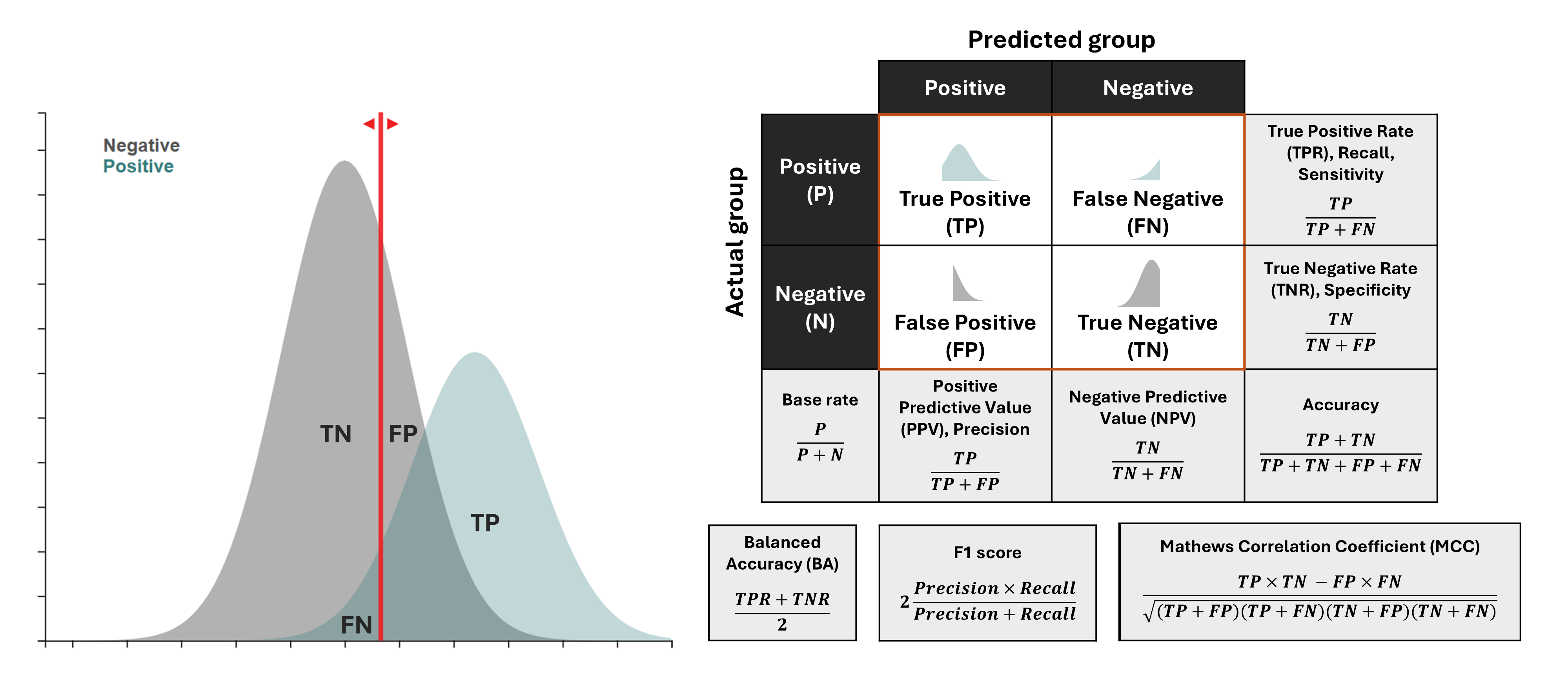
Classification Outcomes and Metrics
When using a predictor to classify cases into two groups, there are four possible outcomes: True Positives (TP), False Positives (FP), False Negatives (FN), and True Negatives (TN). These form the basis for all predictive metrics.
The image above illustrates how these four outcomes are used to derive classification metrics. On the left, you can see how negative (e.g., controls) and positive (e.g., cases) distributions overlap and how a classification threshold (red line) creates these four outcomes. On the right, you can see the confusion matrix and the formulas for key metrics derived from it. Note how some metrics have multiple names (e.g., sensitivity/recall/TPR, precision/PPV) - this reflects how the same concepts are referred to differently across fields like medicine, cognitive science, and machine learning.
A short summary of each metric:
Sensitivity (Recall, True Positive Rate): Measures the proportion of actual positives correctly identified. Useful when missing a positive case is costly (e.g., disease screening), but ignores false positives.
Specificity (True Negative Rate): Measures the proportion of actual negatives correctly identified. Important when false alarms are costly (e.g., confirming a diagnosis before a risky treatment), but ignores false negatives.
Accuracy: The proportion of all predictions that are correct. Intuitive but can be misleading for imbalanced datasets, as it is heavily influenced by the majority class.
Balanced Accuracy: The average of Sensitivity and Specificity. A better measure than accuracy for imbalanced datasets, but it gives equal weight to both types of errors and does not account for the base rate, which is critical for assessing real-world utility.
Positive Predictive Value (PPV, Precision): The proportion of positive predictions that are actually correct. It informatively accounts for base rate, and corresponds to the posterior probability of a condition given a positive test result ("How likely is a positive prediction to be true?"). As such, it is a crucial metric for clinical decision-making.
Negative Predictive Value (NPV): The proportion of negative predictions that are actually correct. It also informatively accounts for the base rate and corresponds to the posterior probability of not having a condition given a negative test result ("How likely is a negative prediction to be true?"). This makes it a crucial metric for ruling out conditions.
F1 Score: The harmonic mean of Precision and Recall. A useful summary when you need to balance finding all positives and not making too many false alarms, though it can be hard to interpret directly.
Matthews Correlation Coefficient (MCC): A correlation between observed and predicted classifications. A balanced measure suitable for imbalanced datasets, but it is less intuitive to interpret and does not reveal the types of errors being made.
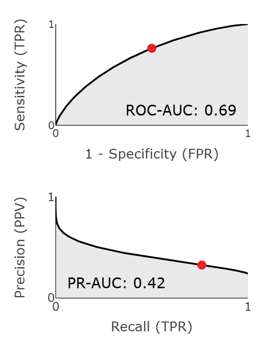
Threshold-Independent Metrics
Some metrics evaluate performance across all possible thresholds and can serve as a better summary of the overall model performance. These include:
ROC-AUC (Area Under the Receiver Operating Characteristic Curve): Summarizes how well a model balances true positives (sensitivity) and false positives (1-specificity) across all possible thresholds. ROC-AUC measures inherent discriminative capacity independent of base rates, which means it remains constant across different outcome base rates. This makes it a valuable metric for comparing models across different populations.
PR-AUC (Area Under the Precision-Recall Curve): Summarizes how well a model balances precision (PPV) and recall (sensitivity) across all thresholds. Because precision is dependent on the base rate, PR-AUC can often be a more informative summary metric for real-world contexts with low base rates. The caveat is that for it to be truly informative, the base rate used to obtain PR-AUC should reflect expected real-world conditions (instead of being based on artificially balanced datasets).
Both ROC-AUC and PR-AUC represent areas under their respective curves and are mathematically expressed as integrals:
\[ROC\text{-}AUC = \int_0^1 TPR(FPR) \, d(FPR)\]
\[PR\text{-}AUC = \int_0^1 PPV(TPR) \, d(TPR)\]
These integrals are computed using trapezoidal numerical integration.
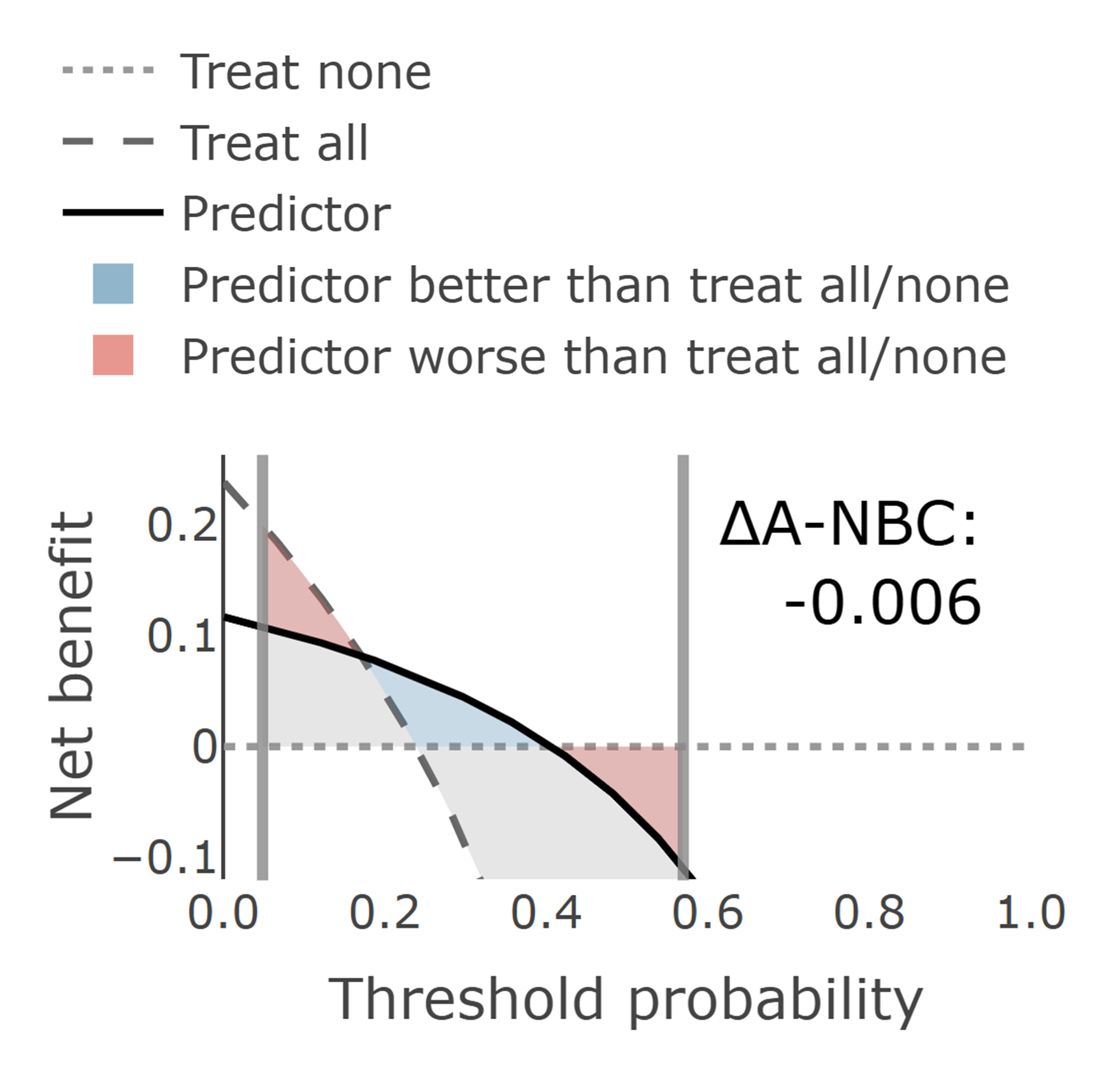
Decision Curve Analysis (DCA)
Decision Curve Analysis (Vickers & Elkin, 2006) evaluates the clinical utility of a predictive model or a single predictor by explicitly balancing the costs of false positives against the benefits of true positives.
A DCA plot typically includes three key curves:
Model: Shows the net benefit of using the model (or a single predictor) at different threshold probabilities.
All: Represents the strategy of intervening for everyone regardless of their predicted risk. This strategy maximizes sensitivity (no false negatives) but results in many unnecessary interventions (false positives).
None: Represents the strategy of intervening for no one, which always yields zero net benefit but avoids all intervention-related harms.
The net benefit formula accounts for both the benefits of true positives and the costs of false positives:
Where Ntotal is the total sample size, and pt is the threshold probability. It represents the minimum predicted probability of an outcome at which you would decide to intervene (e.g., diagnose or treat). For instance, if pt = 0.10, you would intervene for anyone with a predicted risk ≥ 10%. The choice of pt determines a specific balance between sensitivity (finding true cases) and specificity (avoiding false alarms). In practical terms, pt represents the trade-off between benefits and harms: for every 1/(1-pt) - 1 unnecessary interventions you are willing to accept to prevent one adverse outcome. The ratio pt/(1-pt) in the net benefit formula captures this relative weighting of false positives compared to true positives. The optimal pt can be estimated as:
\[p_t = \frac{C_{FP}}{C_{FP} + C_{FN}}\]
Where CFP is the cost of a false positive (unnecessary intervention) and CFN is the cost of a false negative (missed positive case). pt can also be estimated through expert surveys, stakeholder preferences, or established guidelines.
For population screening, pt is typically set low because missing true cases is costlier than unnecessary follow-ups, so more false positives are acceptable. For diagnostic confirmation (e.g., before initiating high-risk treatment), pt is set higher to avoid false positives, reflecting a preference for specificity. As a rule of thumb, screening scenarios may use pt in the 1–10% range, whereas diagnostic decisions often warrant much higher pt (for example 30–70% or more), depending on harms and preferences.
What we often want to know is not the absolute NB, but added value. ΔNB (Delta Net Benefit) measures this additional utility by comparing the model against the better of the two simple strategies (either All or None) at a specific threshold probability:
\[\Delta NB = NB_{\text{model}} - \max(NB_{\text{All}}, NB_{\text{None}})\]
At each threshold probability, the model's net benefit is compared against whichever simple strategy performs better at that threshold. This provides a more conservative and meaningful assessment of the model's added value. A positive ΔNB indicates that the predictive model offers genuine improvement over the best simple strategy, while values near zero suggest that simple strategies may be equally effective.
DCA is particularly valuable because it:
Incorporates the decision-making context through threshold probabilities that reflect real-world scenarios
Accounts for the relative costs of different types of errors (false positives vs. false negatives)
Provides actionable insights about when a model should or should not be used
Facilitates comparison between different models or strategies across various contexts
Predictive utility analysis consists of two key components: (1) estimating real-world predictive value and clinical utility of research findings by accounting for the outcome base rate, and (2) determining how much performance is lost due to measurement reliability.
Predictive utility analysis can be applied in two main scenarios: interpreting existing research findings and planning new studies. Each scenario follows a different workflow, as outlined below.
1. Interpreting Existing Research Findings
When evaluating published research or your own completed studies, the workflow starts with observed metrics and works forward to understand real-world utility:
Set measurement reliability: Ideally, reliability estimates should come directly from the same data set as the observed effect sizes. If not available, use expected estimates based on other relevant research in the field. In principle, one could perform predictive utility analysis by ignoring measurement reliability (setting all reliabilities to 1, for example). This would still allow to estimate real-world utility, but we would not know how diminished predictive performance is due to measurement reliability.
Set observed metrics: This can be effect size (e.g., Cohen's d, Pearson's r) or predictive performance metric (e.g., ROC-AUC, PR-AUC). It is important to ensure that you are using a robust estimate here (not inflated due to small sample or overfitting).
Set base rate: Set the base rate to reflect the expected prevalence in the real-world conditions where the predictor or model will be applied — not the composition of the study sample. For example, if the study used a balanced case-control design (50% cases, 50% controls) but the condition affects only 5% of the target population, use 5% as the base rate to accurately estimate real-world predictive utility.
Set classification threshold: Determine a classification threshold that corresponds to a realistic threshold probability (pt) in Decision Curve Analysis. This threshold should reflect the clinical or practical context where the predictor will be used, balancing the costs of false positives against the benefits of true positives.
Document relevant metrics: Note down all the relevant metrics for the chosen threshold: ROC-AUC, PR-AUC, PPV, NPV, and Net Benefit. These metrics provide a comprehensive picture of the predictor's real-world utility.
2. Planning Studies
When planning new research, the workflow starts from desired clinical utility and works backward to determine what effect sizes and study design are needed:
Identify clinically meaningful targets: Start by determining what level of PR-AUC, PPV, NPV, or Net Benefit would be clinically meaningful in your specific context. These targets should reflect the minimum utility needed to justify using the predictor in practice. This could come from performing cost-benefit analysis, or from existing guidelines, or from using already existing clinical instruments as a benchmark.
Determine required effect sizes: Use the simulator to determine how these clinical targets translate to the needed effect sizes (e.g., Cohen's d, ROC-AUC) by setting the base rate to the expected prevalence in the real-world setting where the predictor or model will be applied. Compare these required effect sizes with typical effect sizes found in relevant research literature to assess feasibility.
Explore ways to improve performance: Use the simulator to explore how much closer you can get to your goal by:
Improving measurement reliability of each predictor (e.g., using more reliable assessment methods or improving measurement protocols)
Using multiple predictors: estimate how many predictors are needed to achieve a desired prediction performance. For average effect size and average collinearity among predictors you can pick what is common in the field or what you find in your own data. Using these values in the multivariable calculator will provide you with a rough estimate of how well a multivariable model would perform without even needing to train it.
Assess feasibility: This analysis can help determine the feasibility of both individual markers and multivariable models.
Quick Start Examples
To further clarify how the tool can be used and to demonstrate its utility we provide some specific examples.
Example 1. Diagnostic Prediction: FDA-Cleared Biomarker for Alzheimer's Disease
Recently, FDA has cleared plasma p-tau217/Aβ42 ratio for assessing amyloid positivity, which is a key criterion for Alzheimer's diagnosis. Let us unpack this example in E2P Simulator as an anchor for all other examples. We will use the report that FDA clearance was based on as a reference for the parameters.
In the Binary outcome mode:
Set the base rate to 51.1%. This is amyloid positivity prevalence in the clearance cohort, which consists targets individuals with mild cognitive impairment. Note, in practice we may expect this to vary between ~ 20% to 80% depending on the average age of the cohort (Jansen et al., 2015).
Set the outcome reliability to 0.9, which is the reliability of PET/CSF reference agreement used to confirm amyloid positivity in the clearance cohort (Harn et al., 2017).
Set the predictor reliability for both groups to 0.9 (test-retest reliability of the assay components; Della Monica et al., 2024).
Setting the effect size in this case is a bit tricky because it is not reported. However, we can instead use the reported PPV and NPV. The report used two thresholds one for PPV and one for NPV, leaving ~20% of indeterminate cases for confirmatory PET/CSF. We only need to consider one of the thresholds to recreate the distributions: for the positive threshold they report 201/255 being true positives and 54/255 being false positives, which corresponds to PPV ≈ 0.92 and NPV ≈ 0.81. Now we adjust the effect size and classification threshld until we achieve these values.
We find this corresponds to observed effect size d = 2.25, yielding ROC-AUC = 0.94 and PR-AUC = 0.95. We also find that the positive threshold corresponds to pt ≈ 0.68, recovering PPV = 0.92, NPV = 0.81, and resulting in ΔNB = 0.324.
Measurement reliability in this case is already very high and improving it will not result in a substantial improvement in predictive performance.
Even if the base rate drops to 30% (e.g., younger mild cognitive impairment cohorts), the scenario still yields PR-AUC = 0.89.
Example 2. Diagnostic Prediction: Depression
Can we predict depression diagnosis using a cognitive biomarker?
In the Binary outcome mode:
Set base rate to 8% (the base rate of depression in adolescents; Shorey et al., 2022)
Set the grouping reliability to 0.28 (depression diagnosis reliability based on DSM-5 field trials; Regier et al., 2013)
Set the predictor reliability for both groups to 0.6 (an average reliability for cognitive measures; Karvelis et al., 2023)
Set the observed effect size to d = 0.8 (a large effect size that is optimistic and rarely seen in practice)
With these parameters, the observed Cohen's d = 0.8 will yield ROC-AUC = 0.71 and PR-AUC = 0.19. This means that even with a "large" effect size of 0.8, the predictive utility remains rather modest, especially when it comes to the tradeoff between PPV and Sensitivity (as shown by the low PR-AUC). Using the DCA plot to set the classification threshold to correspond to 15% risk, pt = 0.15, we obtain PPV = 0.22, Sensitivity = 0.31, and ΔNB = 0.009, which means that at this threshold 78% of diagnoses would be false positives while still missing 69% of actual cases, and we would get 9 additional true positives per 1,000 diagnoses.
Note that with the low reliability values, this observed effect corresponds to a much larger true effect, d = 1.58, and in turn much better predictive performance, ROC-AUC = 0.87 and PR-AUC = 0.46, and PPV = 0.27, Sensitivity = 0.74, and ΔNB = 0.046 at pt = 0.1, highlighting how much improvement in diagnostic prediction could be achieved simply by improving measurement reliability.
We can further explore what it would take to achieve some higher threshold of performance, e.g., PR-AUC of 0.8. Using the tool, we can find that it would require ROC-AUC = 0.96. It would be rather unrealistic to expect a single biomarker to achieve this effect size. Using the multivariable simulator, you can explore how many predictors with smaller d values would be required to achieve a desired prediction performance.
Example 3. Treatment Response Prediction: Antidepressants
Can we predict who will respond to antidepressant treatment using task-based brain activity measures?
Select Continuous outcome mode:
Set base rate to 15% (the rate of response to antidepressant treatment beyond placebo; Stone et al., 2022)
Set predictor reliability to 0.4 (an average reliability for task-fMRI measures; Elliott et al., 2020)
Set outcome reliability to 0.94 (Hamilton Depression Rating Scale (HAMD) reliability; Trajković et al., 2011)
Adjust effect size such that R² = 0.2 (average multivariate R² from recent research; Karvelis et al., 2022)
This will yield ROC-AUC = 0.73 and PR-AUC = 0.33, indicating rather modest predictive performance, as shown by the low PR-AUC. At pt = 0.2, which reflects the relative harms of antidepressant side effects, this would result in Sensitivity = 0.54, PPV = 0.29, and ΔNB = 0.031, which means that 46% of those who would benefit from treatment would not receive treatment, 71% of those given treatment would not benefit from it, and we would get additional 3.1 true responders per 100 people who receive antidepressants. Improving measurement reliability alone could improve performance quite substantially, up to ROC-AUC = 0.87 and PR-AUC = 0.57, which at pt = 0.2 would give Sensitivity = 0.74, PPV = 0.42, and ΔNB = 0.073.
If we want to, again, explore what it would take to achieve PR-AUC of 0.8, we will find it requires R² = 0.8. These are rather extremely ambitious values (requiring to explain 80% of variance in symptom improvement). This helps demonstrate the inherent limitations of dichotomizing continuous outcomes for evaluating treatment response prediction - doing so leads to a loss of valuable information. On the other hand, it does reflect the binary nature of decision-making in psychiatry (to prescribe the treatment or not).
Example 4. Risk Prediction: Suicide Attempts
Clinicians rate prediction of suicidality as the highest priority for AI tool development in mental health (Fischer et al., 2025). Can we predict who will attempt suicide using electronic health records? One of the largest prospective suicide prediction studies (Edgcomb et al., 2021) followed women (N = 67,000) with serious mental illness for 12 months after a general medical hospitalization and trained models on pre-discharge electronic health records to predict readmission for suicide attempt or self-harm, achieving ROC-AUC of 0.73 (derivation sample) and 0.71 (external sample). A companion study (Thiruvalluru et al., 2023) in men (N = 1.4 million) reported a 12-month base rate of 3.9% and similar discrimination.
Set the outcome reliability to 1.0 (hospital admissions for attempts or self-harm can be assumed to be near perfect)
Set the predictor reliability for both groups to 0.8 (structured electronic health records including healthcare utilization, prior attempts, psychiatric diagnoses, etc., can be assumed to have rather high reliability)
Set the observed effect size to d = 0.77, which corresponds to ROC-AUC = 0.71
This yields PR-AUC = 0.10, indicating poor predictive performance in the real world. At pt = 0.03 (a reasonable threshold for intervention), we get Sensitivity = 0.77, PPV = 0.06, and ΔNB = 0.006. This means that while the model would capture about three-quarters of true cases, only 6% of those flagged would actually attempt suicide, and the added benefit would translate to 6 additional true cases per 1,000 individuals.
To achieve PR-AUC = 0.8 in this population would require ROC-AUC = 0.98, which is extremely unrealistic. At pt = 0.03, this would result in Sensitivity = 0.94, PPV = 0.30, and ΔNB = 0.025.
Note that because the reliability is already quite high, improving it further would not make much of a difference. What we need to do is to find better predictors. Alternatively, it may be more effective to simply focus on universal suicide prevention strategies rather than trying to predict individual cases (e.g.,Large 2018).
Example 5. Risk Prediction: Transition to Psychosis
Mismatch negativity (MMN) is among the most promising biomarkers for predicting transition to psychosis within clinical high-risk (CHR) cohorts. The largest longitudinal study (Hamilton et al., 2022) found that converters showed the largest MMN deficit in the double-deviant condition, with d = 0.43. How promising is MMN for this application?
Set the outcome reliability to 0.46 (DSM-5 psychosis spectrum κ; Regier et al., 2013).
Set the predictor reliability for both groups to 0.5 (double-deviant MMN test-retest reliability; Roach et al., 2020).
Set the observed effect size to d = 0.43.
This yields ROC-AUC = 0.62 and PR-AUC = 0.27, indicating modest predictive performance. At a decision threshold of pt = 0.15, which corresponds to relatively low-cost interventions such as increased monitoring, the net benefit is ΔNB = 0.010, with PPV = 0.22 and sensitivity = 0.81.
Improving measurement reliability could improve performance up to d = 0.75, ROC-AUC = 0.70, PR-AUC = 0.36; at pt = 0.15 this would give PPV = 0.26, Sensitivity = 0.78, and ΔNB = 0.026, offering a substantial improvement but still overall modest predictive performance.
Sample Size Calculations for Prediction Models
E2P Simulator includes a sample size calculator to help you determine how much data is needed for your multivariable prediction models. This calculator is designed to help you avoid overfitting and keep prediction error low (following the recommendations from Riley et al., 2020), providing more robust sample size estimates than simple rules of thumb like "10 events per predictor".
How to Use
Specify your number of predictors, realistically expected R² (based on prior research or pilot data), and outcome base rate (for binary outcomes only). Use R²CS for binary outcomes and standard R² for continuous outcomes. Note, for binary outcomes with a single continuous predictor, R²CS equals eta-squared (η²), which is already displayed in the main E2P simulator dashboard. The final recommendation uses the maximum across all criteria to ensure all performance targets are met.
The sample size calculators complement the main E2P simulators in study planning: the E2P simulators explore relationships between effect sizes and predictive utility (both what you need for desired performance and what utility to expect from realistic effects), while the sample size calculators determine adequate sample size based on realistic R² estimates from prior research. For sample size planning, always use conservative, realistic R² estimates based on prior research, not idealized target values.
Prediction Models vs. Hypothesis Testing Sample Sizes
You may wonder how these prediction-focused sample size calculations compare to traditional power analysis used in hypothesis testing. The key difference is that power analysis focuses on detecting whether an effect exists, while prediction-focused calculations prioritize model reliability and performance on new data. This fundamental difference in goals typically leads to larger sample size requirements for prediction models.
Another way to think about this difference is in terms of precision requirements. Power analysis only needs sufficient precision to distinguish an effect from zero (statistical significance). In contrast, prediction models require much tighter confidence intervals around parameter estimates to ensure much more precise estimation of predictive performance / effect sizes.
Calibration
Discrimination tells you whether a model can separate cases from non-cases; calibration tells you whether the predicted probabilities themselves are accurate. A well-calibrated model is one for which people assigned a risk of 20% actually have an observed event rate close to 20%.
The calibration module in E2P Simulator shows what happens when a model is fit in one setting (the test set) and then applied in a different setting (the deployment set) with a different effect size, measurement reliability, and base rate.
Given the normality of the distributions, predicted probabilities are computed analytically using Bayes' rule; the predicted probability of belonging to Group 2 for a predictor value x:
\[P(Y = 2 \mid X = x) = \frac{p(x \mid Y = 2)\phi}{p(x \mid Y = 1)(1-\phi) + p(x \mid Y = 2)\phi}\]
Here, p(x | Y = 1) and p(x | Y = 2) are the conditional normal densities of the predictor in Group 1 and Group 2, respectively, and φ is the base rate.
\[
p(x \mid Y = 1) = \frac{1}{\sigma_1\sqrt{2\pi}} \exp\!\left(-\frac{(x-\mu_1)^2}{2\sigma_1^2}\right),
\quad
p(x \mid Y = 2) = \frac{1}{\sigma_2\sqrt{2\pi}} \exp\!\left(-\frac{(x-\mu_2)^2}{2\sigma_2^2}\right)
\]
μ1 and μ2 are the group means, while σ1 and σ2 are the group standard deviations implied by the selected reliabilities. The calibration curve is then generated by plotting the posterior probabilities from the test set against the posterior probabilities from the deployment set.
Feedback and Contributions
E2P Simulator is an open-source project - feedback, bug reports, and suggestions for improvement are welcome. The easiest way to do so is through the GitHub Issues page.
You can view the source code, track development, and contribute directly at the project's GitHub repository.
For other inquiries, you can find my contact information here.
References
Brabec, J., Komárek, T., Franc, V., & Machlica, L. (2020). On model evaluation under non-constant class imbalance. International Conference on Computational Science, vol. 12140 (pp. 74-87). Springer, Cham. https://doi.org/10.1007/978-3-030-50423-6_6
Christodoulou, E., Ma, J., Collins, G. S., Steyerberg, E. W., Verbakel, J. Y., & Van Calster, B. (2019). A systematic review shows no performance benefit of machine learning over logistic regression for clinical prediction models. Journal of Clinical Epidemiology, 110, 12-22. https://doi.org/10.1016/j.jclinepi.2019.02.004
Della Monica, C., Revell, V., Atzori, G., Laban, R., Skene, S. S., Heslegrave, A., ... & Dijk, D.-J. (2024). P-tau217 and other blood biomarkers of dementia: Variation with time of day. Translational Psychiatry, 14(1), 373. https://doi.org/10.1038/s41398-024-03084-7
Edgcomb, J. B., Thiruvalluru, R., Pathak, J., Brooks, J. O., & Zima, B. (2021). Machine learning to differentiate risk of suicide attempt and self-harm after general medical hospitalization of women with mental illness. Medical Care, 59, S58-S64. https://doi.org/10.1097/MLR.0000000000001445
Elliott, M. L., Knodt, A. R., Ireland, D., Morris, M. L., Poulton, R., Ramrakha, S., Sison, M. L., Moffitt, T. E., Caspi, A., & Hariri, A. R. (2020). What is the test-retest reliability of common task-functional MRI measures? New empirical evidence and a meta-analysis. Psychological Science, 31(7), 792-806. https://doi.org/10.1177/0956797620916786
Fischer, L., Mann, P. A., Nguyen, M.-H. H., Becker, S., Khodadadi, S., Schulz, A., Edwin Thanarajah, S., Repple, J., Hahn, T., Reif, A., Salamikhanshan, A., Kittel-Schneider, S., Rief, W., Mulert, C., Hofmann, S. G., Dannlowski, U., Kircher, T., Bernhard, F. P., & Jamalabadi, H. (2025). AI for mental health: clinician expectations and priorities in computational psychiatry. BMC Psychiatry, 25(1), 584. https://doi.org/10.1186/s12888-025-06957-3
Hamilton, H. K., Roach, B. J., Bachman, P. M., Belger, A., Carrión, R. E., Duncan, E., Johannesen, J. K., Light, G. A., Niznikiewicz, M. A., Addington, J., Bearden, C. E., Cadenhead, K. S., Cannon, T. D., Cornblatt, B. A., McGlashan, T. H., Perkins, D. O., Seidman, L. J., Tsuang, M. T., Walker, E. F., ... Mathalon, D. H. (2022). Mismatch negativity in response to auditory deviance and risk for future psychosis in youth at clinical high risk for psychosis. JAMA Psychiatry, 79(8), 780-789. https://doi.org/10.1001/jamapsychiatry.2022.1417
Harn, N. R., Hunt, S. L., Hill, J., Vidoni, E., Perry, M., & Burns, J. M. (2017). Augmenting amyloid PET interpretations with quantitative information improves consistency of early amyloid detection. Clinical Nuclear Medicine, 42(8), 577-581. https://doi.org/10.1097/RLU.0000000000001693
Jansen, W. J., Ossenkoppele, R., Knol, D. L., Tijms, B. M., Scheltens, P., Verhey, F. R., ... & Amyloid Biomarker Study Group. (2015). Prevalence of cerebral amyloid pathology in persons without dementia: A meta-analysis. JAMA, 313(19), 1924-1938. https://doi.org/10.1001/jama.2015.4668
Karvelis, P., & Diaconescu, A. O. (2025). Clarifying the reliability paradox: poor measurement reliability attenuates group differences. Frontiers in Psychology, 16, 1592658. https://doi.org/10.3389/fpsyg.2025.1592658
Karvelis, P., & Diaconescu, A. O. (2025). E2P Simulator: An Interactive Tool for Estimating Real-World Predictive Utility of Research Findings. Journal of Open Source Software, 10(114), 8334. https://doi.org/10.21105/joss.08334
Karvelis, P., Paulus, M. P., & Diaconescu, A. O. (2023). Individual differences in computational psychiatry: A review of current challenges. Neuroscience & Biobehavioral Reviews, 148, 105137. https://doi.org/10.1016/j.neubiorev.2023.105137
Karvelis, P., Charlton, C. E., Allohverdi, S. G., Bedford, P., Hauke, D. J., & Diaconescu, A. O. (2022). Computational approaches to treatment response prediction in major depression using brain activity and behavioral data: A systematic review. Network Neuroscience, 6(4), 1066-1103. https://doi.org/10.1162/netn_a_00233
Regier, D. A., Narrow, W. E., Clarke, D. E., Kraemer, H. C., Kuramoto, S. J., Kuhl, E. A., & Kupfer, D. J. (2013). DSM-5 field trials in the United States and Canada, Part II: Test-retest reliability of selected categorical diagnoses. American Journal of Psychiatry, 170(1), 59-70. https://doi.org/10.1176/appi.ajp.2012.12070999
Riley, R. D., Ensor, J., Snell, K. I. E., Harrell Jr, F. E., Martin, G. P., Reitsma, J. B., Moons, K. G. M., Collins, G., & van Smeden, M. (2020). Calculating the sample size required for developing a clinical prediction model. BMJ, 368, m441. https://doi.org/10.1136/bmj.m441
Roach, B. J., Carrión, R. E., Hamilton, H. K., Bachman, P., Belger, A., Duncan, E., Johannesen, J., Light, G. A., Niznikiewicz, M., Addington, J., Bearden, C. E., Cadenhead, K. S., Cannon, T. D., Cornblatt, B. A., McGlashan, T. H., Perkins, D. O., Seidman, L. J., Tsuang, M. T., Walker, E. F., ... Mathalon, D. H. (2020). Reliability of mismatch negativity event-related potentials in a multisite, traveling subjects study. Clinical Neurophysiology, 131(12), 2899-2909. https://doi.org/10.1016/j.clinph.2020.09.027
Salazar de Pablo, G., Radua, J., Pereira, J., Bonoldi, I., Arienti, V., Besana, F., Soardo, L., Cabras, A., Fortea, L., Catalan, A., Vaquer Alicea, J., Raballo, A., Barrone, C., Mazzarini, L., Puig, O., González de Artaza, M., Barca, M., Papera, S., ... Fusar-Poli, P. (2021). Probability of transition to psychosis in individuals at clinical high risk: An updated meta-analysis. JAMA Psychiatry, 78(9), 970-978. https://doi.org/10.1001/jamapsychiatry.2021.0830
Shorey, S., Ng, E. D., & Wong, C. H. J. (2022). Global prevalence of depression and elevated depressive symptoms among adolescents: A systematic review and meta-analysis. British Journal of Clinical Psychology, 61(2), 287-305. https://doi.org/10.1111/bjc.12333
Stone, M. B., Yaseen, Z. S., Miller, B. J., Richardville, K., Kalaria, S. N., & Kirsch, I. (2022). Response to acute monotherapy for major depressive disorder in randomized, placebo controlled trials submitted to the US Food and Drug Administration: Individual participant data analysis. BMJ, 378, e067606. https://doi.org/10.1136/bmj-2021-067606
Thiruvalluru, R. K., Edgcomb, J. B., Brooks, J. O., & Pathak, J. (2023). Risk of suicide attempts and self-harm after 1.4 million general medical hospitalizations of men with mental illness. Journal of Psychiatric Research, 157, 50-56. https://doi.org/10.1016/j.jpsychires.2022.10.035
Trajković, G., Starčević, V., Latas, M., Leštarević, M., Ille, T., Bukumirić, Z., & Marinković, J. (2011). Reliability of the Hamilton Rating Scale for Depression: A meta-analysis over a period of 49 years. Psychiatry Research, 189(1), 1-9. https://doi.org/10.1016/j.psychres.2010.12.007
Vickers, A. J., & Elkin, E. B. (2006). Decision curve analysis: A novel method for evaluating prediction models. Medical Decision Making, 26(6), 565-574. https://doi.org/10.1177/0272989X06295361
 E2P Simulator